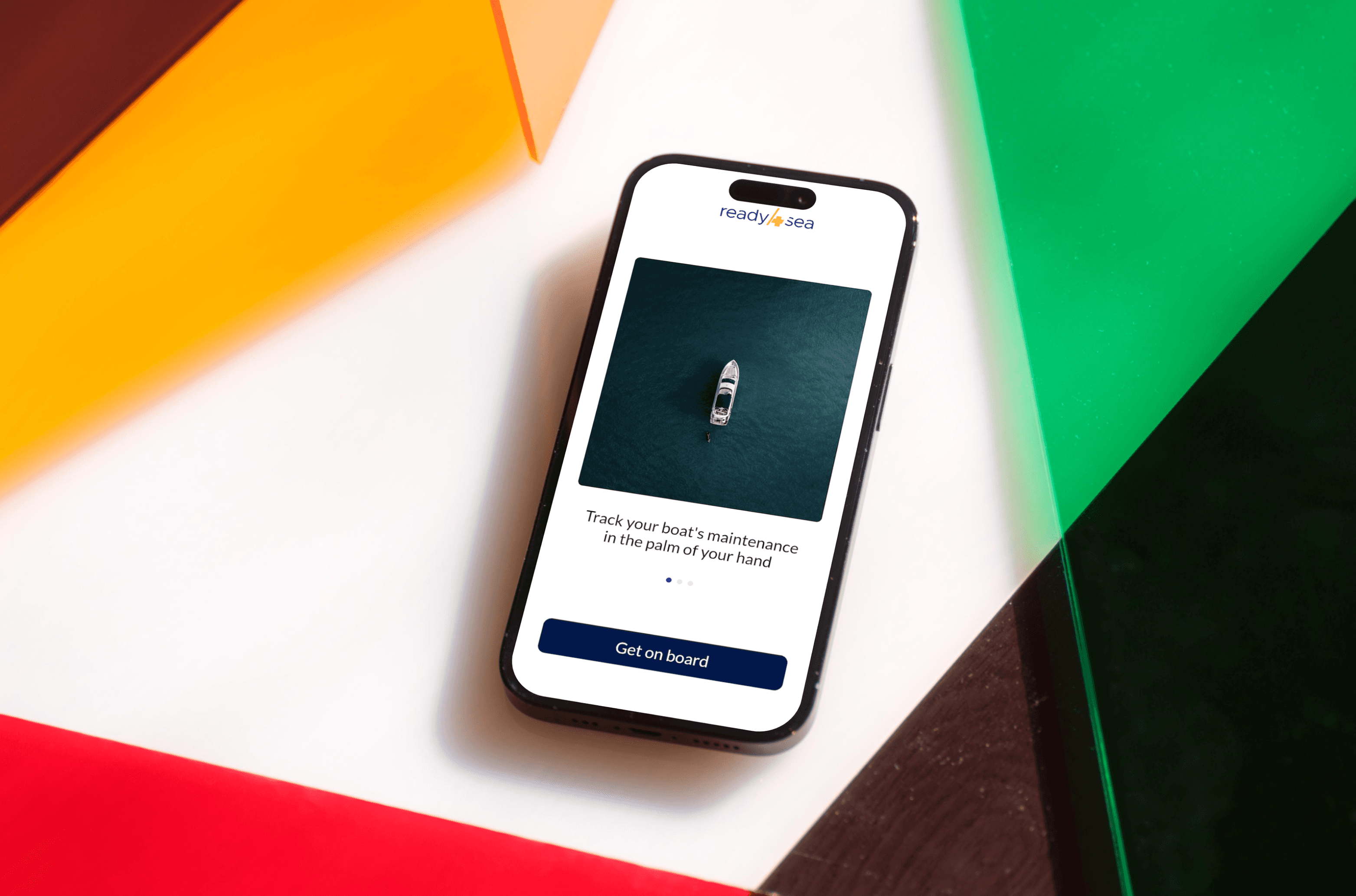
Navigation Design: The Ready for Sea User Experience
Analysing a mobile app designed to help boat owners upkeep and maintain their vessels. The goal of the case study was to analyse the app which lead to discovering usability issues. This resulted in a redesign proposal, by simplifying navigation with logical, intuitive categories. This is where the organized architecture and streamlined user flows came in.
2024
Year
1 Week
Duration
Pro
Category
Miro
Stack
Problem
Ready4Sea’s a mobile app designed to support sailors and boat owners with essential maintenance and voyage planning, faces challenges with its navigation structure. Its complex navigation and inconsistent layout create user frustration, especially during onboarding, as the app’s structure makes essential features hard to find. Confusing terms and an overload of information contribute to high cognitive load, posing a barrier to the app’s adoption.
Solution
Through a detailed analysis, I proposed a new information architecture and navigation that organizes essential features under intuitive categories. By redefining the app's core sections and implementing consistent CTAs with clearer UX writing, this proposal simplifies navigation, reduces friction, and enhances usability—making Ready4Sea more accessible and scalable for boat owners, as well as fostering consistent engagement and improving user retention.